
How UX shapes success in shopping apps

UX is the system that converts user intent into completed purchases. It does this by removing friction, signalling trust, and enabling fast decisions at every step from discovery to checkout. Worldwide retail e-commerce sales continue to grow year on year, which means the cost of a poor experience compounds with every new customer who bounces. Baymard’s 2026 mobile app UX benchmark, covering 3,300+ performance scores across 340+ UX parameters, makes clear that most apps still fail on the basics: checkout friction, weak search, and CTAs placed outside thumb reach. Mobile-first patterns built around these constraints can deliver 25–40% higher conversion rates compared with desktop designs shrunk to fit a phone screen.
WantThis applies this thinking directly to wishlist and gifting flows: a lightweight add-flow by pasting a product link, clear item metadata, and private reservation so that gifts are not duplicated. The principle is the same whether you are building a marketplace or a gift-list tool. Get the UX right and revenue follows.
Key takeaways
Good UX in a shopping app is a measurable growth lever: the teams that treat checkout completion, retention, and load time as owned metrics consistently outperform those that treat UX as a design function.
| Point | Details |
|---|---|
| Mobile-first patterns lift conversion | Mobile-specific patterns such as sticky CTAs and thumb-zone navigation can deliver 25–40% higher conversions than desktop-repurposed designs. |
| Guest checkout is non-negotiable | Forcing account creation before payment is a leading cause of abandonment; offer registration after the purchase confirmation screen. |
| Speed is a UX feature | Loading delays above three seconds sharply increase abandonment; skeleton screens and image optimisation reduce perceived wait without back-end changes. |
| Measure upstream and downstream | Track search success rate, add-to-cart rate, and checkout completion weekly; use session recordings to explain why funnels drop. |
| WantThis as a reference implementation | WantThis applies UX principles to gifting flows via universal link scraping, price tracking, and private reservation across hundreds of UK retailers. |
30/60/90-day action plan:
- Days 1–30: Fix the top three drop-off points in your analytics funnel. Enable guest checkout if it is not already live. Add skeleton screens to your slowest-loading pages. Run a five-user usability test on your checkout flow.
- Days 31–60: A/B test one change to your product page CTA placement. Audit your search for zero-result queries and add synonyms or redirects. Run an accessibility check with Lighthouse and fix all critical errors.
- Days 61–90: Implement cohort retention analysis. Build a personalisation layer for returning users (persistent filters, size memory). Review your push notification strategy and segment by behaviour rather than broadcasting to all users.
Table of Contents
- What UX features does every shopping app need to get right?
- How do mobile-first design principles change the shopping experience?
- Why do performance, trust signals, and accessibility change user behaviour?
- How do you measure UX impact and prioritise fixes?
- Common UX mistakes that silently cost you revenue
- A practical UX process for shopping apps: research, prototype, measure, iterate
- How WantThis applies UX principles to wishlist and gifting flows
- Handling error states and user frustration effectively to reduce drop-offs
- UX should be treated as a growth lever, not a cost line
- WantThis makes wishlist UX practical for gift-buyers and list creators
- Sources
What UX features does every shopping app need to get right?
The role of UX in shopping apps is most visible in the features users touch on every session. Get these wrong and no amount of marketing spend recovers the lost revenue.
- Navigation. Bottom tab bars keep primary sections within thumb reach. Limit top-level tabs to five or fewer and label them with plain nouns (“Home”, “Search”, “Bag”, “Account”) rather than invented brand terms users have to learn.
- Search. A search bar that handles misspellings, synonyms, and partial phrases is table stakes. Predictive suggestions with thumbnail images reduce the number of taps to a product page and lift search-to-purchase rates. Hide search behind a magnifier icon and you will lose a measurable share of high-intent users before they find anything.
- Product pages. Hero images need to be large, zoomable, and swipeable. Price must be visible without scrolling. Variant selectors (size, colour) should update the image in real time. A persistent “Add to cart” CTA that sticks to the bottom of the screen as the user scrolls through reviews is one of the highest-return mobile patterns available.
- Reviews and social proof. Star ratings, verified purchase labels, and a visible review count reduce purchase anxiety. Shipping timelines and return policy summaries on the product page itself, not buried in a footer, remove the last common objection before checkout.
- Personalisation. Adaptive flows go further than “you may also like” carousels. Size helpers that remember previous selections, preference filters that persist across sessions, and category entry points tuned to browsing history all reduce the number of steps between landing and buying.
- Push notifications. Re-engagement messages work when they are timely and relevant: a price drop on a saved item, a low-stock alert, or an abandoned-cart reminder sent within the hour. Generic broadcast notifications train users to disable them.
- Checkout. Guest checkout is not optional. Forcing account creation before payment is one of the most reliably documented causes of abandonment. Offer account creation after the purchase confirmation screen, when the user has already committed. Support mobile wallets (Apple Pay, Google Pay) to reduce form-filling to a single biometric confirmation.
Pro Tip: Before adding any new feature, check your analytics for the step where users drop off most. Build the smallest version of a fix for that step and test it with five users before writing a line of production code.
How do mobile-first design principles change the shopping experience?
A phone is not a small laptop. The interaction model is fundamentally different: one hand, a thumb as the primary input, a screen that is often viewed in motion or poor light. Markswebb’s 2026 analysis argues that mobile is now the primary commerce interface, and that speed, predictive personalisation, and device-native capabilities are what separate high-performing apps from the rest.
The table below maps the three core screens of a shopping app to the mobile patterns that matter most on each.
| Screen | Key mobile pattern | Why it matters |
|---|---|---|
| Home / discovery | Bottom tab navigation, thumb-zone hero CTAs | Primary actions reachable without repositioning the hand |
| Product page | Sticky “Add to cart” bar, swipeable image gallery, collapsible detail sections | Reduces scroll depth and keeps the purchase action always visible |
| Checkout | Single-page or minimal-step flow, mobile wallet support, inline validation | Fewer taps and no page reloads between intent and confirmation |
Thumb zones divide the screen into easy, stretch, and hard-to-reach areas. Place primary CTAs in the central lower third. Navigation elements and destructive actions (delete, cancel) belong in the harder-to-reach upper corners, where accidental taps are less likely.
Progressive disclosure is the principle of showing only what the user needs at each step. On a product page, show the headline specs and price first; put full technical details, size guides, and care instructions behind an expandable section. On checkout, collect only the fields needed for the current step before advancing. Cognitive load drops and completion rates rise.
Skeleton screens replace blank loading states with a grey wireframe of the incoming content. Users perceive the wait as shorter because something is happening. Combined with image optimisation and lazy loading, skeleton screens are one of the fastest wins available for perceived performance without touching back-end infrastructure.
Why do performance, trust signals, and accessibility change user behaviour?
Speed is a UX feature, not an infrastructure concern. Research summarised by RetailTechInnovationHub shows that even small loading delays can meaningfully reduce conversion, with the effect compounding on mobile connections. A user who waits more than three seconds for a product page to load is likely to leave before seeing the price.
Trust signals work in parallel with speed. A user who arrives quickly but sees no payment logos, no visible return policy, and no review count will still hesitate at checkout. The minimum credible set includes:
- Secure checkout indicator (padlock, HTTPS confirmation)
- Accepted payment method logos at the point of payment entry
- Verified reviews with a visible count and recency filter
- Return and refund policy summary on the product page
- Live support entry point (chat or callback) visible during checkout
Accessibility is often treated as a compliance task rather than a growth lever. A peer-reviewed study of e-commerce platforms found that navigational ease and clear visual hierarchy are significant contributors to user satisfaction scores. WCAG 2.1 AA compliance covers the basics: sufficient colour contrast, tap targets of at least 44×44 points, descriptive alt text on product images, and keyboard-navigable flows. Apps that meet these standards also tend to perform better in screen-reader audits, which correlates with cleaner component architecture and fewer edge-case bugs.
Pro Tip: Track both technical performance (time to interactive, Largest Contentful Paint) and business KPIs (checkout abandonment rate, trust-signal click rate) in the same dashboard. When a technical metric moves, you will see the business impact within the same reporting period.
Key metrics to monitor across performance and trust:
- Time to interactive (target: under 3 seconds on a mid-range device)
- Checkout abandonment rate (segment by device type)
- Accessibility error count per release (track with axe or Lighthouse)
- Trust-signal engagement rate (clicks on payment logos, return policy, reviews)
How do you measure UX impact and prioritise fixes?
Measurement turns UX from opinion into evidence. Start by defining the outcome metric that matters most for your app: conversion rate, average order value, or 30-day retention. Then map the upstream signals that predict it.
| KPI | Data source | Measurement cadence |
|---|---|---|
| Search success rate | In-app analytics (search with results vs. zero results) | Weekly |
| Add-to-cart rate | Analytics funnel | Weekly |
| Checkout completion rate | Analytics funnel, segmented by device | Weekly |
| 30-day retention | Cohort analysis | Monthly |
| Task completion rate | Usability test sessions | Per research sprint |
| Session recording insights | Heatmap and recording tool (e.g. Hotjar, FullStory) | Fortnightly review |
Quantitative tools give you scale. Analytics funnels show where users drop off. A/B tests confirm whether a change improves the outcome metric or just looks better in a design review. Cohort retention analysis reveals whether UX improvements are keeping users who would otherwise churn.
Qualitative tools explain why. A usability test with five to ten participants on a specific task (find a product, add it to the cart, complete checkout as a guest) will surface friction points that no funnel report can name. Session recordings and heatmaps show where users tap, hesitate, and abandon. The combination of both is what makes prioritisation defensible.
Prioritise fixes using an impact × confidence × effort matrix. A fix that affects the checkout funnel (high impact), is supported by both analytics data and usability test findings (high confidence), and requires a single component change (low effort) should ship before a redesign of the home screen that affects a smaller share of sessions.
Common UX mistakes that silently cost you revenue
Most shopping app revenue losses are not caused by missing features. They come from friction that users never report because they simply leave.
- Hidden search. A magnifier icon with no visible search bar forces users to discover the feature. Surface the search bar on the home screen and add autocomplete with visual results.
- Forced account creation. Requiring registration before checkout is one of the most reliably documented causes of abandonment. Enable guest checkout and offer account creation on the post-purchase confirmation screen.
- Unreachable CTAs. An “Add to cart” button placed at the top of a product page is outside thumb reach on most phones. Move primary CTAs to a sticky bar at the bottom of the screen.
- Overcomplicated filters. A filter panel with 40 options for a category that has 12 products creates decision paralysis. Show only filters relevant to the current category and display active filters as removable chips above the results grid.
- Slow pages with no perceived performance. A blank white screen during loading feels broken. Add skeleton screens and optimise images to WebP format with responsive sizing.
- Unclear error states. A red border on a form field with no explanation of what went wrong sends users to a dead end. Use inline validation with plain-language messages (“Please enter a valid UK postcode”) and show a progress indicator so users know where they are in a multi-step flow.
A practical UX process for shopping apps: research, prototype, measure, iterate
Good UX in a shopping app is not a one-time design sprint. It is a repeatable discipline with four stages.
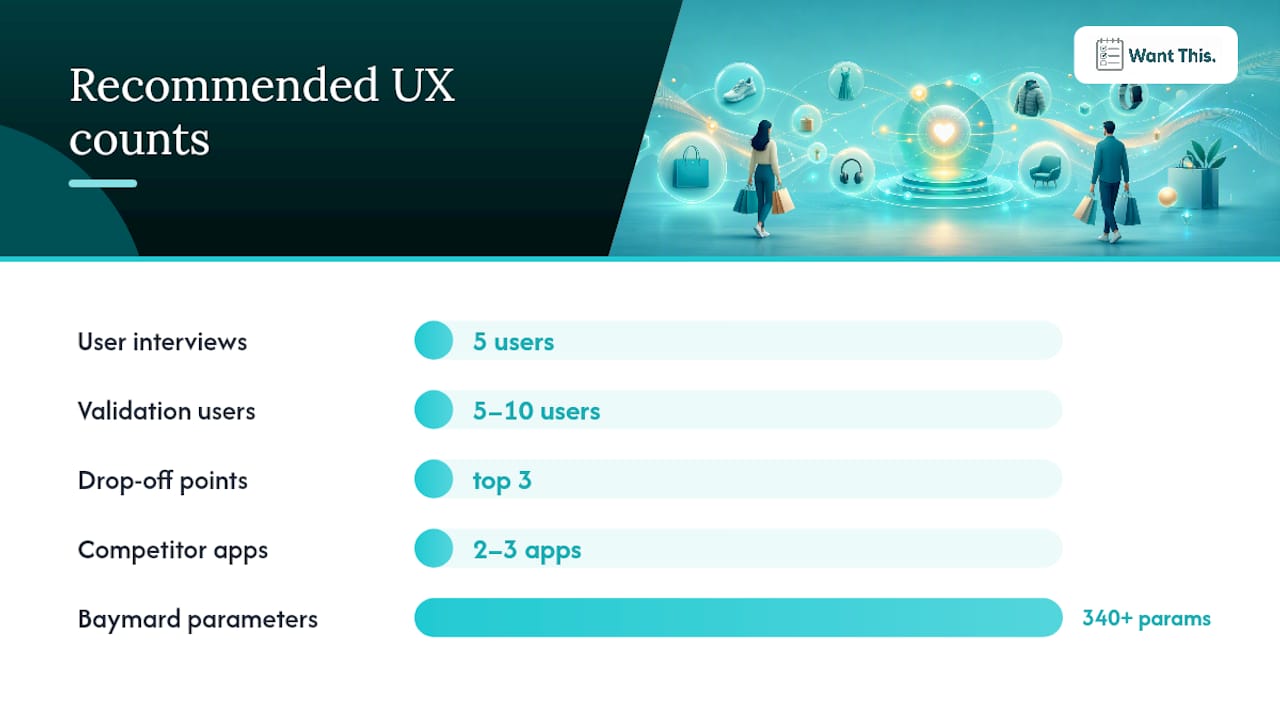
- Research. Review your analytics for the top three drop-off points. Conduct five short user interviews (15–20 minutes each) focused on a specific task. Audit two or three competitor apps for navigation patterns, search behaviour, and checkout flows. Document what you find in a single shared document.
- Prototype. Build the smallest testable version of a fix for the highest-priority issue. A clickable prototype in Figma or a staging build with a single changed component is enough. Validate with five to ten users using task-based testing: give them a goal, observe without prompting, and note where they hesitate or fail.
- Ship an experiment. Release the change behind a feature flag or as an A/B test. Define your success metric before launch (checkout completion rate, add-to-cart rate) and set a minimum observation period of two weeks to account for novelty effects.
- Iterate. Review results against the pre-defined metric. If the change wins, roll it out and document the learning. If it loses, investigate the session recordings for the variant and form a revised hypothesis.
Release checks before every launch:
| Check | Tool | Pass criterion |
|---|---|---|
| Performance budget | Lighthouse / WebPageTest | LCP under 2.5s, TTI under 3s |
| Accessibility audit | axe, Lighthouse | Zero critical errors |
| Analytics instrumentation | In-app event tracking | All key events firing correctly |
| Rollback criteria | Feature flag system | Defined metric threshold for auto-rollback |
One-page audit template items to run before every major release:
- Primary task success rate (can a new user find and add a product in under 60 seconds?)
- Load time on a mid-range Android device on a 4G connection
- CTA visibility without scrolling on the product page
- Trust signals present at checkout (payment logos, return policy, secure indicator)
- Checkout completion funnel: are all steps instrumented and reporting?
- Error rate threshold: are error events below the baseline from the previous release?
Baymard’s 2026 benchmark provides 340+ UX parameters that teams can use directly as acceptance criteria for mobile commerce features, which removes the guesswork from deciding what “good” looks like.
How WantThis applies UX principles to wishlist and gifting flows
Gifting is a multi-party UX problem. The list creator, the gift-buyer, and the recipient all have different goals, different devices, and different moments of intent. WantThis was designed with this in mind.
The challenge: users need to build a list quickly, across multiple retailers, without duplicating gifts or spoiling surprises. The standard wishlist pattern (one retailer, one account) does not solve this.
Design choices WantThis made:
- Universal link scraping. Paste any product URL from any retailer and WantThis pulls in the title, image, and current price automatically. The add-flow takes under ten seconds and requires no manual data entry.
- Price tracking. Saved items are monitored across hundreds of UK retailers. Users receive alerts when a price drops, which reduces the anxiety of adding something expensive and waiting. This is a direct application of the trust-signal principle: give users information that helps them decide with confidence.
- Private reservation. Gift-buyers can mark an item as reserved without the list owner seeing it. This solves the duplicate-gift problem without requiring any coordination between buyers. The UX outcome is a reduction in the most common gifting frustration.
- Secret Santa organiser. An automatic name draw with exclusions and reminders removes the coordination overhead from group gifting entirely.
Expected outcomes from these design choices include higher task completion for list creation (fewer steps, no manual entry), higher click-throughs from shared lists to retailers, and a measurable reduction in duplicate purchases. For teams building gifting or social shopping features, the WantThis approach to frictionless gift buying offers a practical reference for how UX decisions map to user behaviour.
Handling error states and user frustration effectively to reduce drop-offs
Error states are where most apps lose users they had already won. A user who reaches the checkout page has demonstrated high intent. An unclear error at that point, a failed payment with no explanation, a form that resets on submission, does not just cause a single abandoned session. It damages trust in a way that reduces the likelihood of a return visit.
The most common failure is a generic error message: “Something went wrong. Please try again.” This tells the user nothing about what went wrong, what they should do differently, or whether their data was saved. The fix is specific, plain-language messaging tied to the exact field or step that failed. “Your card was declined. Please check the card number and expiry date, or try a different payment method” is actionable. “Payment error” is not.
Inline validation prevents errors from accumulating. Checking a field as the user completes it (email format, postcode validity, card number length) means errors are caught one at a time, in context, rather than as a list at the point of submission. Users who see a single inline correction are far more likely to fix it and continue than users who submit a form and receive five error messages at once.
Progress indicators matter in multi-step flows. A checkout that shows “Step 2 of 3” gives the user a sense of how much effort remains. Without it, every additional screen feels like an unexpected obstacle. The same principle applies to loading states: a spinner with no context feels slower than a skeleton screen that shows the shape of the incoming content.

Finally, preserve user input across errors. If a payment fails, the address and contact fields should remain populated. Asking a frustrated user to re-enter information they already provided is one of the fastest ways to convert a recoverable situation into a permanent abandonment.
UX should be treated as a growth lever, not a cost line
The framing that holds most teams back is treating UX as a design budget rather than a revenue mechanism. Every friction point in a shopping app is a conversion tax. Every trust signal you add is a conversion subsidy. The maths is straightforward once you accept that UX decisions have measurable financial consequences.
The compounding effect of small fixes is consistently underestimated. A 2% improvement in checkout completion on a high-traffic app is not a minor metric movement. Across a year of sessions, it is a material revenue shift. The teams that capture this are the ones who treat UX improvements like product experiments: define the metric, run the test, measure the outcome, and reinvest the learning.
The discipline is also what makes UX defensible in a budget conversation. “We improved the checkout flow” is a design claim. “We improved checkout completion by 2% and attributed £X in incremental revenue to the change” is a business claim. The second one does not get cut.
For gift-list and wishlist products specifically, the UX stakes are higher than they appear. A list that is hard to build will not be shared. A list that is not shared generates no gift-buyer traffic. A gift-buyer who encounters friction at the retailer link-out does not complete the purchase. Every step in that chain is a UX decision with a direct revenue consequence.
WantThis makes wishlist UX practical for gift-buyers and list creators
If you are working on gifting or social shopping flows and want a reference implementation of the UX principles covered here, WantThis is worth exploring. It solves three specific UX problems that most wishlist tools leave unaddressed: multi-retailer list building in under ten seconds, price-drop alerts that keep saved items relevant over time, and private reservation that prevents duplicate gifts without requiring any coordination between buyers.
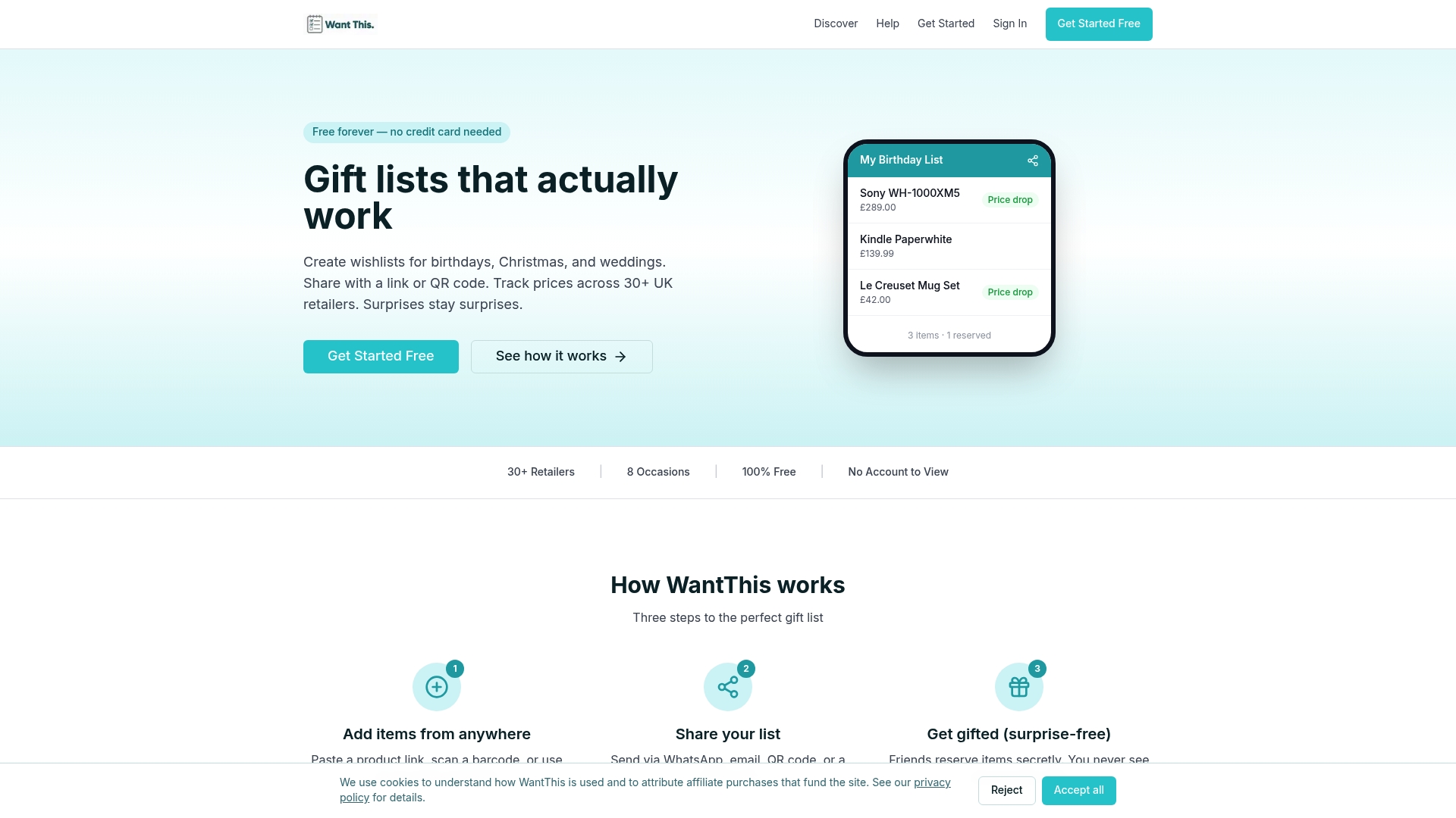
The price tracking and sharing features are a practical starting point if you want to see how these patterns work in a live product. A useful pilot: share a wishlist with a small group, track which items generate click-throughs to retailers, and use that data to understand which product metadata (image quality, price visibility, description length) drives the most engagement. The findings will be directly applicable to your own product page and sharing flow decisions.
To get started, visit WantThis and create a free list.
Sources
The claims in this article are supported by the following sources. Each is worth reading directly if you want to go deeper on a specific area.
- Baymard — New mobile app UX benchmark (2026)
- Statista — Worldwide retail e‑commerce sales
- How UX design impacts e‑commerce conversion rates — RetailTechInnovationHub (2026)
- ScienceDirect — UI/UX impact on e‑commerce (research paper)
- Ecosire — Mobile UX best practices for eCommerce
- Markswebb — UX for m‑commerce in 2026